Engaging New
Senyumku Bank
Users Through Gamification
Redesigning the early-user activation journey for Celengan by introducing gamification into the registration flow, turning a high drop-off funnel into a structured, motivating path toward active saving.
*Specific metrics are confidential. Results are described directionally in alignment with what can be shared publicly.
Overview
Celengan is Senyumku Bank's flagship savings product. Growing the number of active users (people who not only sign up but genuinely start saving) is one of the most direct levers for increasing the total balance the product holds. But a significant portion of new users were dropping off during the early journey, before ever becoming active. They were signing up and disappearing. The registration flow was the critical failure point, and this initiative targeted it directly with gamification.
Result: The solution improved registration completion rates, increased early-user engagement, and drove positive movement in activation metrics, contributing to the broader goal of growing active Celengan users. Observed through post-launch monitoring via Firebase, tracking real user behavior after release.
When Registration Becomes the Bottleneck
Internal funnel analysis revealed a clear activation problem. New users were signing up for Celengan but dropping off before completing account setup, never reaching the point where they could actually start saving. Early-stage engagement was not translating into meaningful activation, and without active users, the product's core purpose of building balance couldn't be realized.
The most acute drop-off concentrated in the registration and initial account setup phase. This wasn't a problem with the product itself; the downstream saving experience worked well for users who reached it. The leak was earlier, in the motivation gap between signing up and following through. There was a clear distance between what users were required to do and what compelled them to complete it.
Objective
Increase the number of active Celengan users by redesigning the early-user activation journey, starting with the registration flow where drop-off was highest. More active users meant more balance growth. The objective wasn't just to get users through setup; it was to set the behavioral foundation for saving.
New Signup → Completed Setup → Active Saver → Balance Growth
Success criteria. Measurable improvement in registration completion rate, activation into key product actions, and engagement within the early-user journey, tracked through internal analytics and experiment frameworks.
Hypothesis
Primary
Introducing progress-based missions and rewards into the early-user journey would improve registration completion and drive activation by making the process feel structured, engaging, and worth completing.
Visible progress would reinforce momentum and reduce perceived effort.
Rewards would create positive reinforcement at key milestones.
Breaking tasks into missions would reduce cognitive load compared to a linear undifferentiated flow.
The Strategic Bet
Instead of focusing on surface-level UI improvements, I proposed a behavioral approach using gamification to address the motivation gap causing users to abandon registration. Three principles shaped the solution.
Progress visibility over complexity. Users should always know where they are and how close they are to done.
Motivation over obligation. The experience should make users want to continue, not just require them to.
Clarity over novelty. Engagement mechanics only work if users understand them immediately.
One guardrail stayed constant throughout: gamification is not the end goal. Every mechanic had to directly contribute to activation, moving users from signup to active saver, or it earned its removal.
Behavioral Framework
Octalysis Framework
Yu-kai Chou's Octalysis Framework identifies eight core drives that motivate human behavior in any system. Rather than optimizing for efficiency, it optimizes for human motivation, the right lens for an engagement problem. These weren't applied as a checklist; they were used as a diagnostic lens to pressure-test whether each design decision was actually motivating, or just decorative.
Epic Meaning & Calling
Users believe they are the "chosen one" on a meaningful mission.
Development & Accomplishment
Users feel like they're progressing toward something real.
Ownership & Possession
Users stay engaged because they feel invested in what they've built.
Loss & Avoidance
Users act to prevent losing progress they've already accumulated.
Scarcity & Impatience
Sequential missions build anticipation and drive return visits.
Unpredictability & Curiosity
Surprise rewards and animations keep the experience fresh.
Designing for Delight
Therese Fessenden distinguishes between deep delight (systemic, structural) and surface delight (local, contextual). For this initiative, surface delight was the right lever, well-placed moments of joy tied to specific user actions, delivered through animations, tactile transitions, microcopy, and high-quality imagery.
"In order for gamification to be successful, we must find the intersection of the business goal and the user goal. When implemented thoughtfully, gamification can be a wonderful method to increase engagement and improve the user experience."
Alita Joyce
Building the Right Concept
Stakeholder Alignment
I facilitated a co-concepting session with Business Development and Product Owner to align on reward mechanics, user motivation, and implementation feasibility. We explored multiple reward directions, including cashback, balance-based incentives, and vouchers, then narrowed the solution based on behavioral relevance, scalability, and implementation cost.
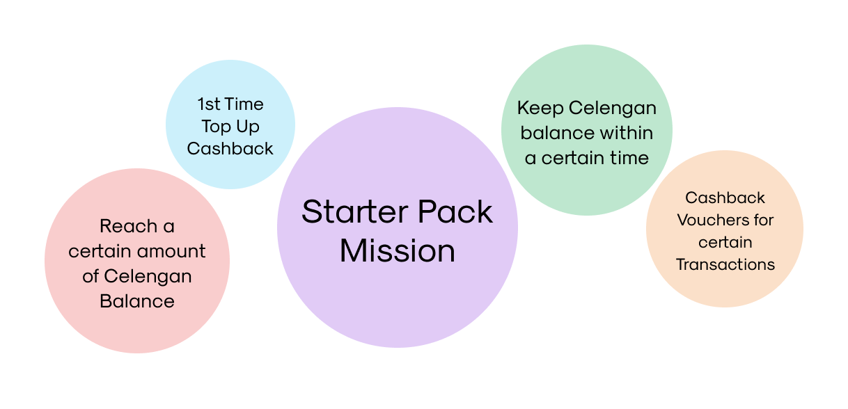
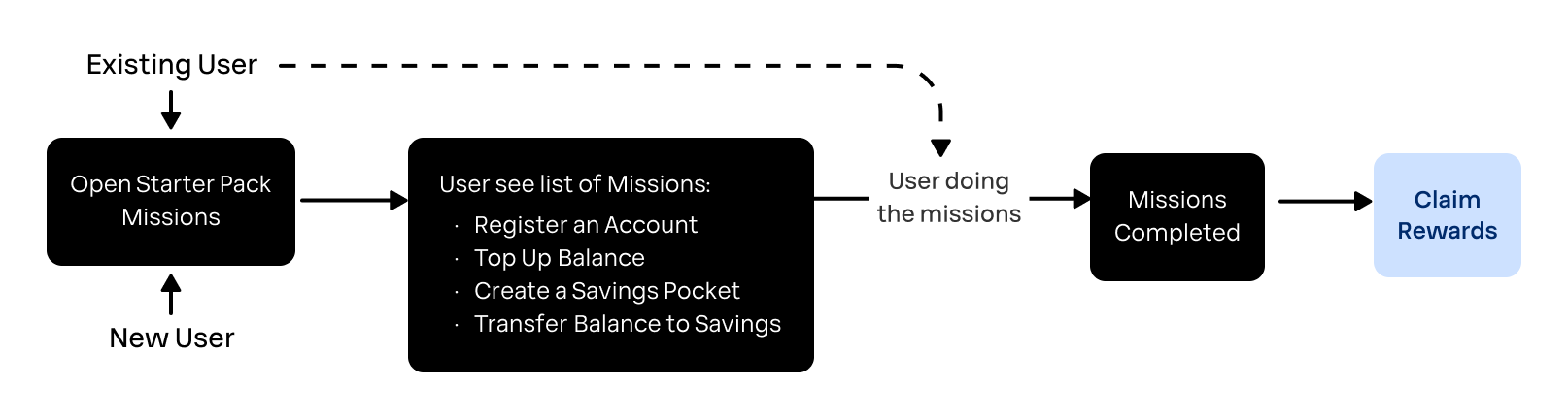
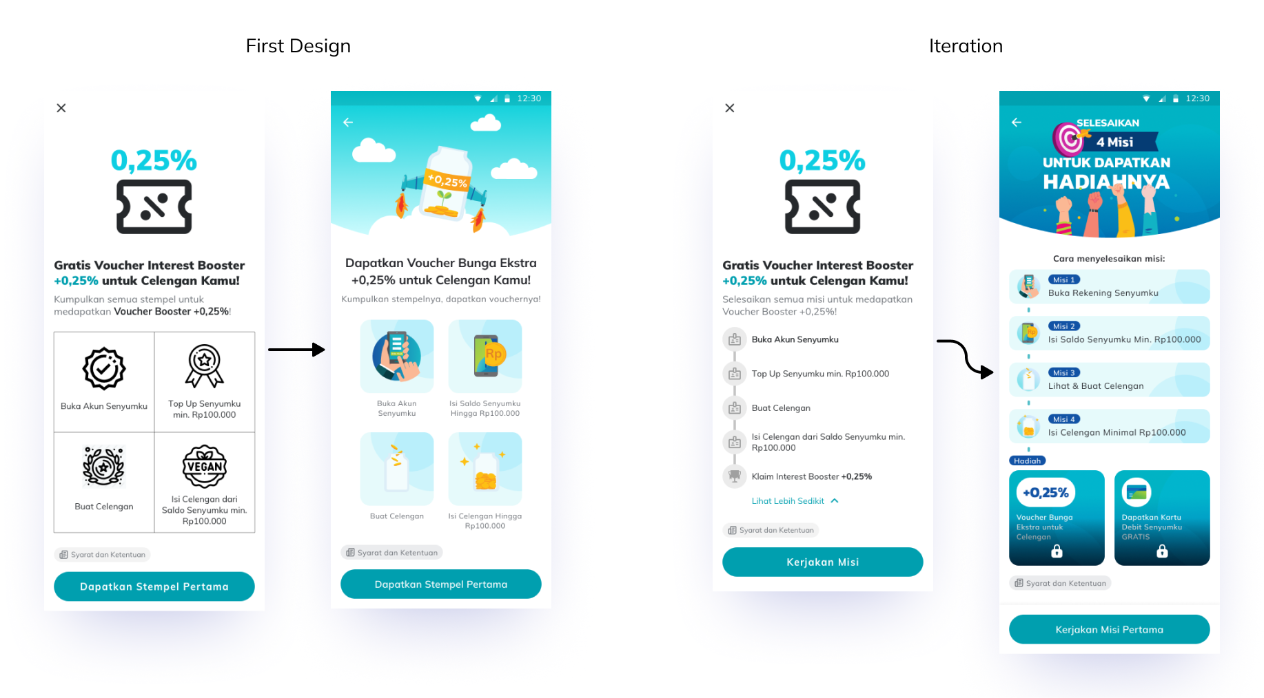
Solution Direction: Starter Pack Mission
One direction emerged clearly. The Starter Pack Mission concept aligned naturally with registration stages users were already moving through, enabled progressive engagement without requiring a new mental model, and could be implemented incrementally and validated quickly.
Four simple missions, each mapped to a stage of the new user journey, from registration through first deposit. The solution didn’t introduce new steps, it reframed existing ones into a more motivating progression.
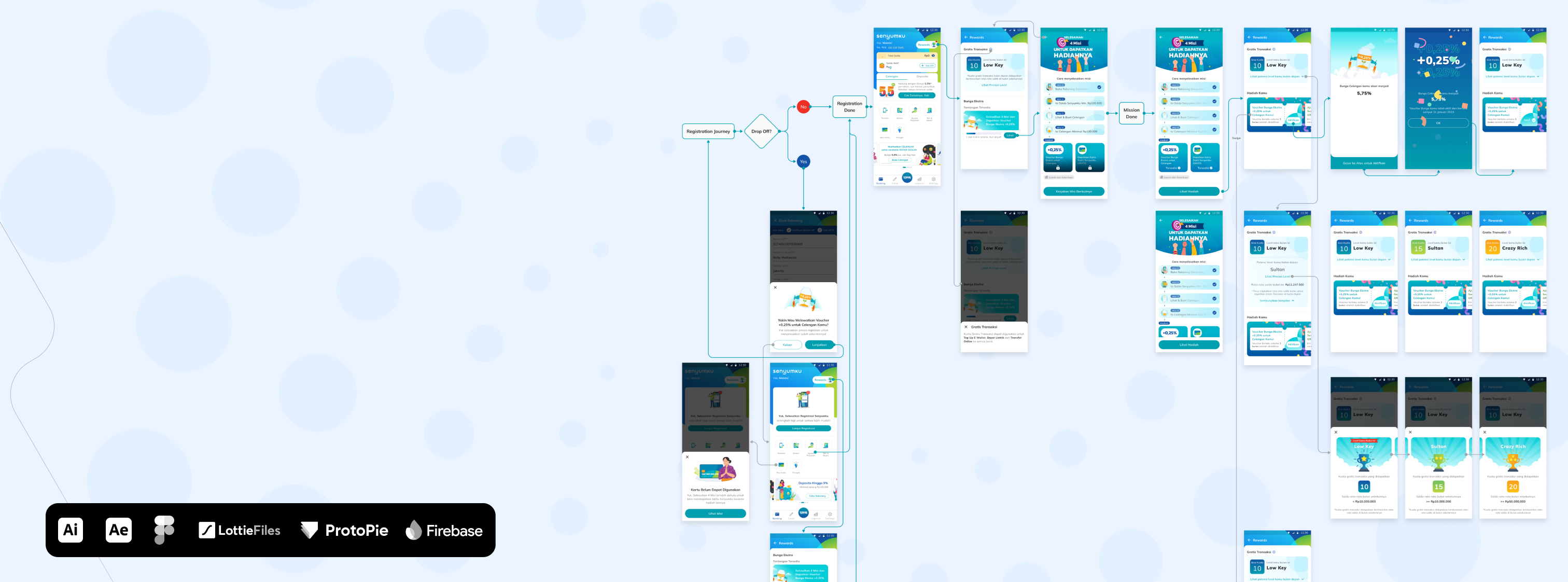
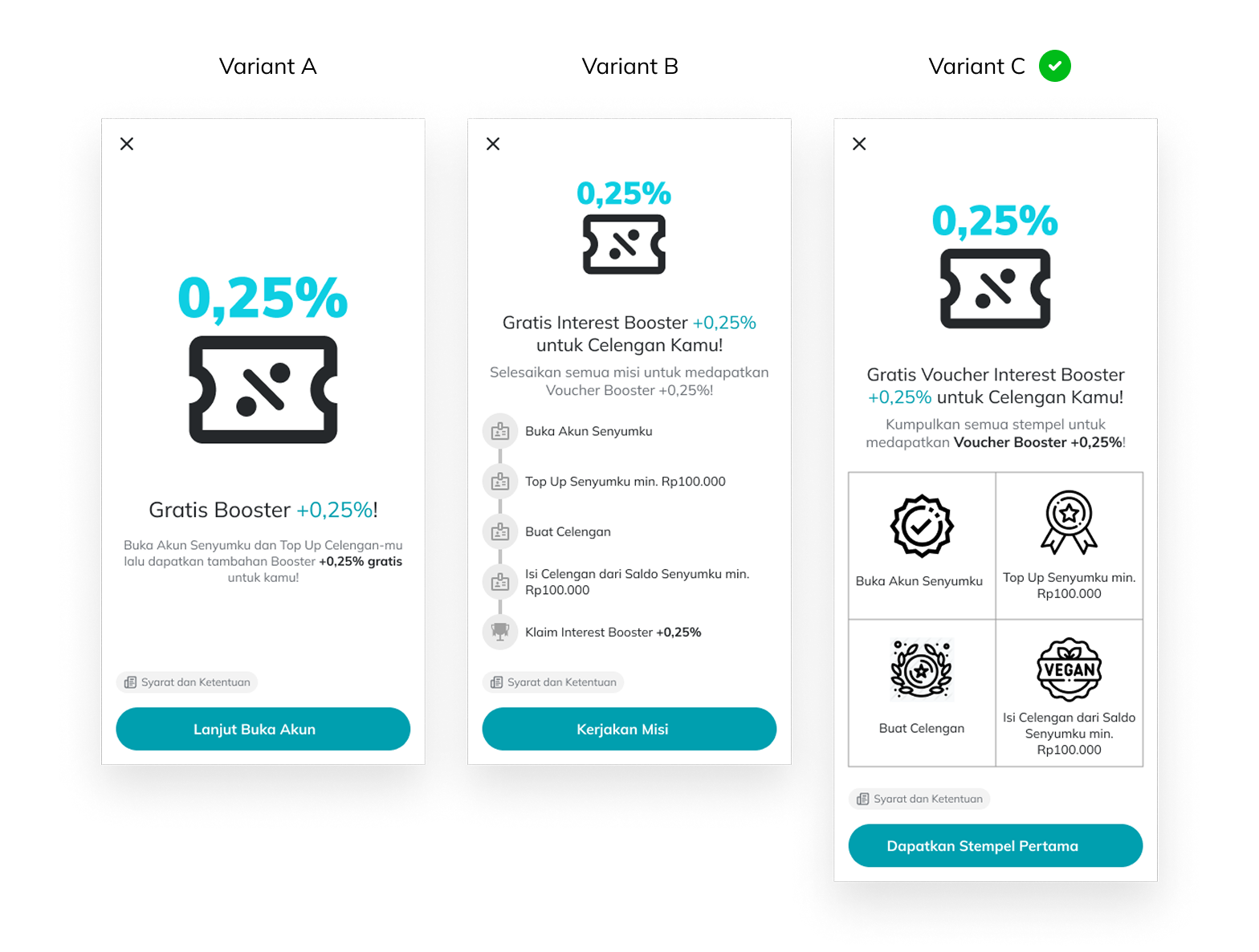
Design Exploration
Multiple design variants were explored to test different levels of visual engagement and navigational clarity. Each variant represented a different hypothesis about what would capture attention and sustain motivation at first entry. I recommended the final direction because it balanced visual engagement with navigational clarity while scaling cleanly across the full registration journey.
Craft & Implementation
I translated the behavioral strategy into concrete product decisions across flow structure, mission states, feedback loops, and motion design. I intentionally kept the flow linear to reduce cognitive load and maintain momentum during first-time account setup.
Game Mechanics
Progress indicators, reinforcing achievement and momentum
I designed the registration entry to feel goal-oriented and motivating, rather than transactional. The experience was framed as an adventure, a mission to complete, stages to move through, a reward at the end. I explored several variants before landing on the final direction, each testing a different balance of visual drama and informational clarity.
Rewards, creating positive reinforcement at milestones
Each time a user completes a mission, a progress label surfaces to mark their advancement. Progress visibility isn't cosmetic, it's the psychological engine that sustains motivation. It validates effort, creates momentum, and raises the perceived cost of quitting mid-flow.
Sequential missions, reducing cognitive load through ownership
Completed missions create a sense of progress users naturally want to finish. I reinforced this through clear completed, active, and locked states to make the remaining steps feel achievable.
Exit reminders, reducing drop-off through loss aversion
When users attempt to leave mid-flow, the app reminds them of the rewards they’re about to leave behind. I used loss aversion intentionally here to reduce drop-off during incomplete registration. Because missions must be completed one at a time in sequence, the reward stays just out of reach until the work is done. This pacing sustains engagement across return sessions, not just the first one.
Delightful Experiences
Completing all four missions should feel like an arrival. The reward claim screen uses illustration and animation to create a genuine sense of celebration, reinforcing positive emotions and strengthening user satisfaction at the most important moment in the journey.
The centerpiece is the Rocket Jar, a visual metaphor for the user's interest rate taking off after reward activation. Rather than animating it as a flat asset, I separated the illustration into independent components so each element could move on its own timeline, creating layered energy rather than a single uniform motion.
I timed the animation to appear only after reward activation, reinforcing the sense of achievement at the moment users completed the journey.
Engineering Considerations
Tooling
Adobe After Effects → Bodymovin → JSON (Lottie)
Validation
All files tested on LottieFiles before engineering handoff
Performance
Minimal file size, smooth across devices, low load impact
Integration
A few lines of code, no large asset imports required
High Fidelity
The final design combines illustration and animation to create a celebratory moment proportional to the effort users put in. Visual and motion elements work together to reinforce satisfaction and close the registration flow on a high note.
Testing & What Changed
Usability Testing
Usability testing surfaced one consistent issue: participants were unclear about which mission to start with. The registration layout didn't make the sequence immediately legible, creating hesitation before a single action had been taken.
Key Insight
Mission sequencing wasn't clear at a glance, users needed to understand order before they could act, and the layout wasn't giving it to them.
Iteration
Based on usability findings, I redesigned the registration layout to make sequencing more obvious and reduce hesitation before users started the first mission. After the change, users proceeded confidently without prompting. One focused redesign. Measurable difference in comprehension.
Outcome
Impact
A controlled experiment wasn't the right validation approach here, reaching statistically meaningful results would have taken longer than the initiative's timeline allowed. Instead, we relied on post-launch monitoring via Firebase to observe how real users moved through the flow after release. Specific metrics are confidential, but behavioral signals showed clear positive movement across the early-user funnel, from registration through activation.
Improved registration completion rates across new user cohorts.
Increased activation into key product actions during early user sessions.
Positive movement in active user metrics, directly contributing to the balance growth objective the initiative was designed to support.
Key Learnings
The results validated my core assumption: reducing motivational friction through structured progression was more impactful than adding more guidance or instructional UI.
Gamification works when tied to actual user goals, not just engagement tactics. Each mission succeeded because it was something users needed to do anyway. The game gave existing steps meaning rather than adding new ones.
Clear progression is a stronger motivator than visual complexity. The animations amplified motivation; the structure created it.
Early activation friction has outsized downstream impact. A user who doesn't complete setup never becomes an active saver. Fixing the entry point compounds: every improvement here is multiplied across the entire user base that follows.
Looking ahead. I’d explore personalized mission paths and retention tracking to understand whether early activation behavior translates into long-term saving habits.